• Profile
  • Clients
  • News
  • Work
  • Archive
  • Contact
  • FacebookTwitter

Moth and Rust

Search

When?

July
  • January
  • February
  • March
  • April
  • May
  • June
  • July
  • August
  • September
  • October
  • November
  • December
  • All
2012
  • 2025
  • 2024
  • 2023
  • 2022
  • 2021
  • 2020
  • 2019
  • 2018
  • 2017
  • 2016
  • 2015
  • 2014
  • 2013
  • 2012
  • 2011
  • All

What?

  • ads
  • advertising
  • architecture
  • art
  • awards
  • blogs
  • books
  • branding
  • chad
  • colour
  • design
  • digital
  • environment
  • events
  • experiments
  • fashion
  • film
  • flashback friday
  • food
  • identities
  • illustration
  • interiors
  • lil b
  • logos
  • magazines
  • MandR news
  • MandR work
  • music
  • nature
  • news
  • packaging
  • photography
  • posters
  • product
  • random
  • science
  • shopping
  • shops
  • social
  • tech
  • textiles
  • theatre
  • travel
  • typography
  • uncategorized
  • web
  • ALL
  • MARTIN CREED work no. 1343

    sharefacebooktwitter
    26 July 2012


    Hey the MLE!

    Hope things are well in Vancouver.  I mean really, how cool is Martin Creed?  He's sort of on fire this year.  He's still doing his band thing (which I posted about earlier).  And his ballet was cool.  And his Work No. 1197 is launching on Friday to announce the opening of the Olympics (where everyone in the land must ring a bell as fast and loud as possible for 3 minutes, starting at 8.12 am).  Yes I will be participating.

    Anyway, on top of all this, he has designed a restaurant.  To quote the wallpaper site with the full article, Work No. 1343 "comprises every single piece of furniture and cutlery in the restaurant - with each one being different.

    We will have to go for dinner there next time  you're in town.

    Over and out,

    Suzan x

     
    Posted in: interiors food art
    -Tags: martin creed
  • cape cod BOATHOUSE

    sharefacebooktwitter
    20 July 2012


    Hello from Cape Cod!

    As you know, I've been here for almost the last 2 weeks, and it's perhaps one of the most serenely beautiful places I've ever been to. The beach, the flowers, the sky ... plus hot, sunny, proper summer weather! Just been hanging out with Stefan's family, swimming, reading in the garden, playing with Ania on the beach. Pure relaxation! Wanted to share some photos I took in the family's boathouse, which is like a perfectly curated treasure chest of random beauty: nautical artifacts, seashore findings, tools, vintage sporting memorabilia, art, ropes, and boats - of course. I took my camera in there and basically went bananas. Thought of you immediately, because it's the sort of thing that we both get excited by.... new and old and rusty and random... a collection of items that could never be created consciously, except by accumulation over time.

    E. xx
    Posted in: travel random
    -Tags: boathouse cape cod summer travel
  • THE OLYMPICS 2012 BRAND

    sharefacebooktwitter
    15 July 2012


    Hey the MLE,

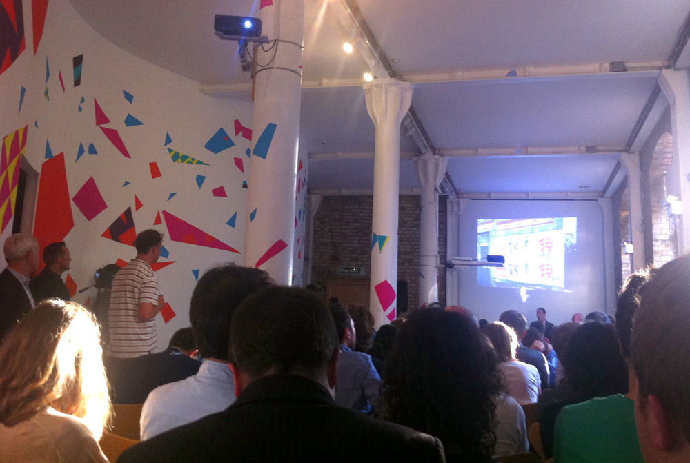
    Been meaning to post about this for awhile now. As you know, I went to a talk at Wolff Olins about the 2012 Olympics logo branding on July 4th. Evidently there was some sort of gag order on WO until this talk, which is why they have not said much about their work. As a big fan, I was quite curious to learn more.

    I always wondered how WO managed to push through such a "unsafe" design. They said it was because they the logo work was done very very early in the process, shortly after London won the bid. The new stakeholders were thinking big and open and ambitiously, rather than safe. WO did not think this logo would have passed if the process happened later on, when this momentum had slowed and more stakeholders were involved.

    The brand was to be aimed at younger people, as previously the olympic games attracted older people, so therefore more people could benefit. It was not to be for the elite - it is for everyone.

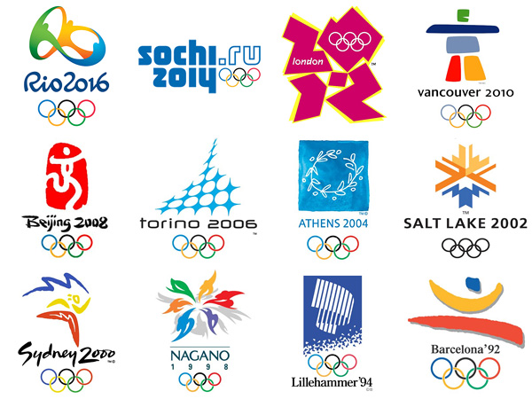
    There are 3 versions of the logo, one for the olympics (with the 2012 + london + 5 rings); one for the paralympics (with the 2012 + london + the paralympic symbol) and one with just 2012. This third logo can be used by anyone whether in London or not, and ideally beyond the 2012 games.

    The application of the brand was described by WO as "prescribed anarchy." Again, in the spirit of openess and inclusiveness, users of the brand were encouraged to really own it, and be creative with it. Unfortunately, this did not happen as much as WO has hoped. The brand police were strict, due in part to the fact that sponsors paid the big bucks for exclusive rights - they wanted to own the brand, not anyone.

    Finally, by creating such a young, non-elite, "street" brand, the older more conservative audiences seemed to have been a bit alienated, which again defeated the whole "more inclusive" goal. For example, the merchandise is not selling as well as hoped, as these people do not seem to be as comfortable wearing such crazy designs.

    I know some people who think that if the Olympic committee wanted a tradition-breaking logo that would seem cool to teens and young adults, perhaps there are other agencies who understand the fickle tastes of this audience a bit better. They love the overall feel/idea but think it could have been executed better.

    I can appreciate this, but I still also appreciate WO's effort. It was great to hear WO say that they knew they were disobeying the conventions of good taste. They even admitted to having a meeting with a potential big British client cancelled, in part because of the fiasco this brand caused them.

    Sure you can hate it and call the 2012 London Olympics branding what you will, but you can never call it boring. And that is the worst thing design can be called in my opinion.

    Even the haters would admit that it is young, it is energetic, a bit wacko, unexpected, a bit all over the place and it is not quiet, safe and boring. Suits East London completely!

    Et voila.

    Suzan x
    Posted in: design branding
    -Tags: branding logo olympics 2012 paralympics wolff olins