• Profile
  • Clients
  • News
  • Work
  • Archive
  • Contact
  • FacebookTwitter

Moth and Rust

Search

When?

All
  • January
  • February
  • March
  • April
  • May
  • June
  • July
  • August
  • September
  • October
  • November
  • December
  • All
2025
  • 2025
  • 2024
  • 2023
  • 2022
  • 2021
  • 2020
  • 2019
  • 2018
  • 2017
  • 2016
  • 2015
  • 2014
  • 2013
  • 2012
  • 2011
  • All

What?

  • ads
  • advertising
  • architecture
  • art
  • awards
  • blogs
  • books
  • branding
  • chad
  • colour
  • design
  • digital
  • environment
  • events
  • experiments
  • fashion
  • film
  • flashback friday
  • food
  • identities
  • illustration
  • interiors
  • lil b
  • logos
  • magazines
  • MandR news
  • MandR work
  • music
  • nature
  • news
  • packaging
  • photography
  • posters
  • product
  • random
  • science
  • shopping
  • shops
  • social
  • tech
  • textiles
  • theatre
  • travel
  • typography
  • uncategorized
  • web
  • ALL
  • URAL MUSIC NIGHT posters

    sharefacebooktwitter
    5 April 2019


    Hello MLE,

    Saw this on Brand New a few weeks ago and love it and thought I'd share as I know you will love it too - as this was exactly our idea we created for our grad school project (which was a a long time ago now)! 

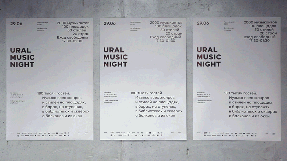
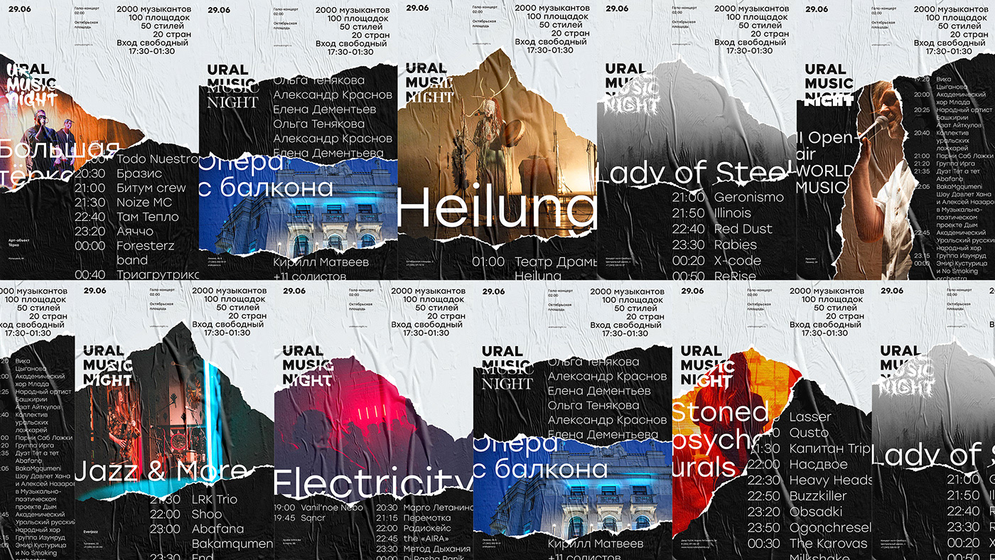
    Ural Music Night is a music festival in Yekaterinburg, Russia. Different posters are pasted overtop of each other: first tear shows the festival branding, second tear shows genre logo and artist name or venue, and the last tear has show information. Perhaps it’s not the most easily accessible information but this isn’t airport signage, and conceptually, I love how it works.

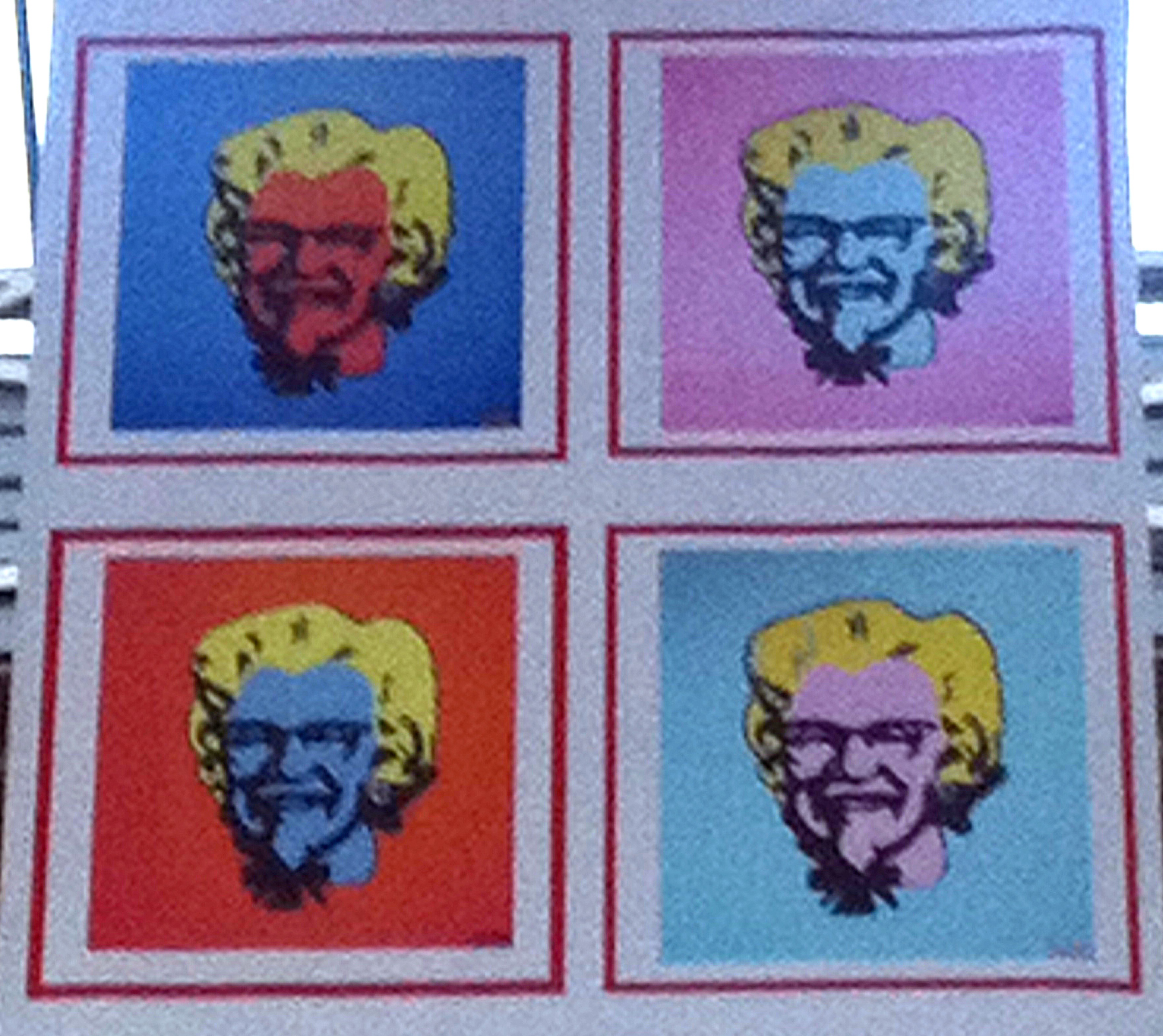
    Our grad project was called 'MOTHandRUST,' a fictional clothing brand that allowed us to really explore graphic design in some interesting ways (and yes that is how we got the name of our studio). 

    For the MOTHandRUST posters, we wanted to show how our sweaters changed and morphed over time. Different posters were pasted overtop of each other: the brand new sweater at the top, first tear shows what the sweater looks like older, last tear, what the sweater looks like after it has been worn a lot (very different as it was designed to change with use and washes). So as the posters get torn and age, you can see how the product featured in the posters ages as well.

    I looked all over for the photos, which would have been great to see again, but they are stored away on CDs, and I have no way to play a CD!

    Suzan
    Posted in: posters
    -Tags: Ural Music Night
  • TYPE DIRECTORS CLUB exhibition 2012

    sharefacebooktwitter
    15 November 2012


    Hey hey MLE,

    Well well well, finally here are the photos I took while at the Type Directors Club 2012 exhibition at JWT here in London back in October.  Was worth checking out (and not just for the free drinks). I've included a dozen photos of my favourites, no need to comment thankfully. I'm sure it will inspire something somehow whether it is type overlaid on top each other several times, joined together with blue tape, or printed in irritatingly jarring colours. All good stuff.

    Looking forward to our meet in the morning. Though I can't stand mornings...

    S  x
    Posted in: typography posters
    -Tags: posters type directors club typography
  • The Colonel

    sharefacebooktwitter
    22 May 2011


    MLE,

    Came across this poster on the street the other day. I don't know what the poster was for, and so on, maybe should have paid more attention. Anyway, we've all seen the Warhol treatment applied to almost everything, I know. But applied to The Colonel just works well. Sort of Pop Art on top of Pop Art.

    Suzan
    Posted in: posters art
    -Tags: the Colonel