• Profile
  • Clients
  • News
  • Work
  • Archive
  • Contact
  • FacebookTwitter

Moth and Rust

Search

When?

October
  • January
  • February
  • March
  • April
  • May
  • June
  • July
  • August
  • September
  • October
  • November
  • December
  • All
2023
  • 2025
  • 2024
  • 2023
  • 2022
  • 2021
  • 2020
  • 2019
  • 2018
  • 2017
  • 2016
  • 2015
  • 2014
  • 2013
  • 2012
  • 2011
  • All

What?

  • ads
  • advertising
  • architecture
  • art
  • awards
  • blogs
  • books
  • branding
  • chad
  • colour
  • design
  • digital
  • environment
  • events
  • experiments
  • fashion
  • film
  • flashback friday
  • food
  • identities
  • illustration
  • interiors
  • lil b
  • logos
  • magazines
  • MandR news
  • MandR work
  • music
  • nature
  • news
  • packaging
  • photography
  • posters
  • product
  • random
  • science
  • shopping
  • shops
  • social
  • tech
  • textiles
  • theatre
  • travel
  • typography
  • uncategorized
  • web
  • ALL
  • #FlashbackFriday: Communicating 15 years of science

    sharefacebooktwitter
    20 October 2023


    The McGovern Institute for Brain Research is a community of MIT neuroscientists committed to understanding the brain and to applying this knowledge to improve human health and well-being. For the occasion of its 15th anniversary, an ambitious booklet was created to give current and potential supporters a real sense of the progress that has been made—as well all the progress that is yet to be made.

    Instead of creating a standard chronological timeline listing facts, a storyline was created based on discoveries of different size scales from small to large (Genes / Neurons&Synapses / Neural Circuits / Whole Brain Imaging). Four discoveries were identified in each of these four categories. 

    An accordion book that opens to 63” wide was chosen as as effective format to illustrate the forward momentum of these 12 discoveries, giving equal weight to each. A series of lines moving from left to right contribute to the forward trajectory. This book can be easily folded into a small 4.5” x 6” book that it can be carried or put in the post.
    Ensuring that the focus is never inward, the context of the larger field of neuroscience is also included. A coloured ribbon running along the bottom compares where neuroscience research is today, compared where it was 15 years ago. 

    The overall messaging does not require a lot of time or study to understand. Care is always taken to not only highlight the “what,” but also the “why.”
    Posted in: MandR work flashback friday
    -Tags:
  • A typeface everyone should know → Ed Interlock

    sharefacebooktwitter
    2 October 2023

    The Ed Interlock font uses “Artificial Ed-telligence to arrange letter combos for a more hand-done appearance!” exclaims its creators, House Industries.

    What is AI up to now you might ask? “Disrupting the type industry,” perhaps? Here is the problem: handwritten digital fonts don’t really look convincingly like actual handwriting. There are many reasons for this, but one reason is that font software simply cannot make design decisions the way a professional letterer can. It cannot ensure that each individual letter in a word works beautifully with the others, in an overall balanced way.

    Enter Ed Interlock. This is best explained using the visual below.

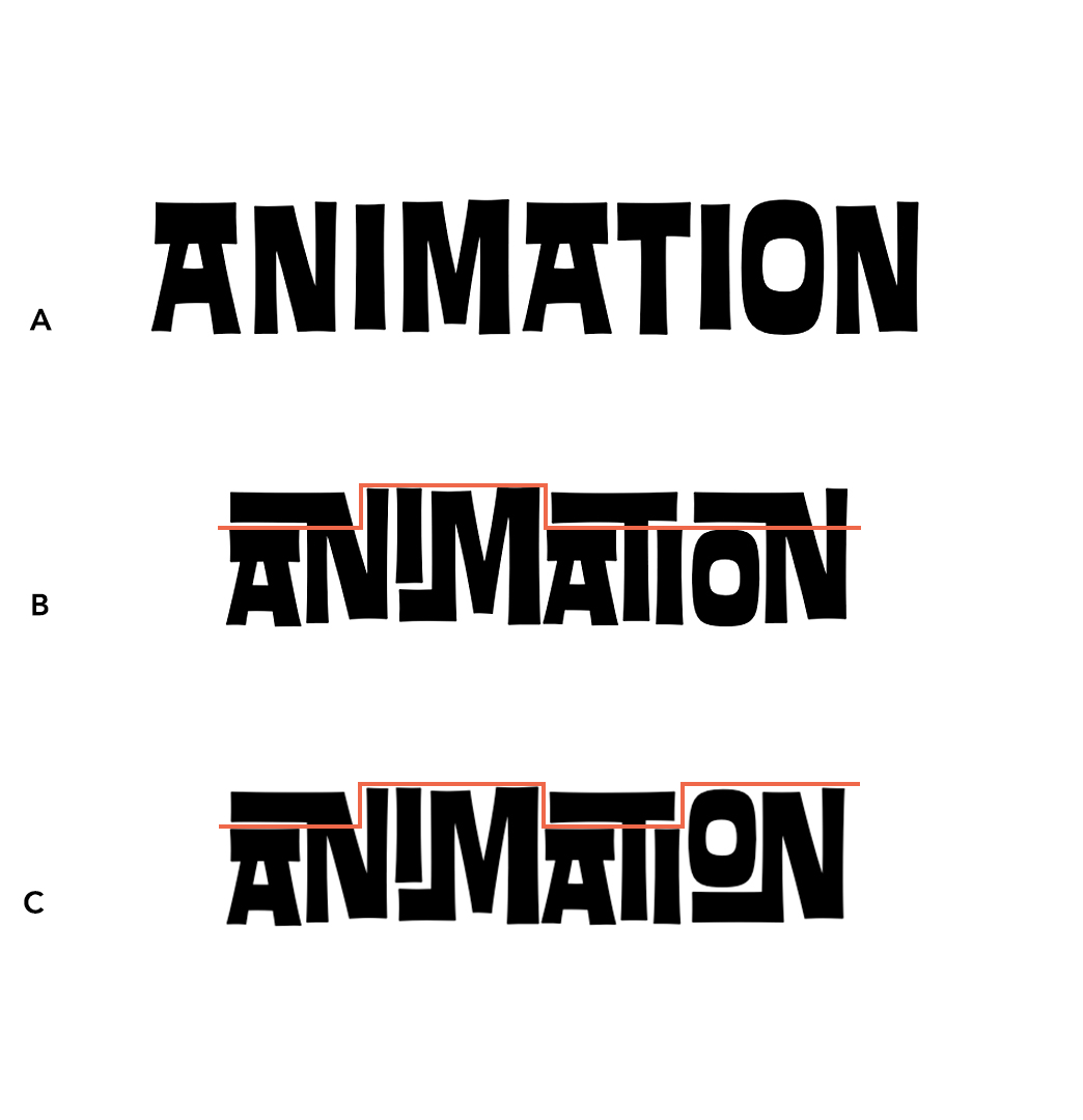
    A. Letters do not overlap. Each letter of the typeface is sitting next to each other.  If you squint your eyes, you can see that A has a lot of awkward empty 'white space' around the letters compared to the B and C. This looks like something done by a computer.

    B. Letters overlap depending on the letter sitting to either side. Here we have the AN, IM, ATI and ON overlapping so that these pairs of letters fit nicely together with no awkward white space. These overlapping letters are called “ligatures.” 

    C. Letters overlap depending on the letter sitting to either side AND on the letters found in the entire word. This is an example of the font technology at work. The software can detect that B is off-balance: three of the ligatures are low and only one is high. To fix this, it automatically sets the last ligature high (the letter pair “ON”). Now we have four ligatures that are balanced: low, high, low and high. 

    In C, the word looks much more like something a design professional would create, rather than a computer. The font technology, called Open Source, is not actually new, but it is being used in a new way. Open Source allows for contextually-sensitive languages to be typed on a computer. These include Arabic and Sanskrit, where a letter shape depends on where, and in what order, it appears within a word or string of words.

    If you would like to work with this typeface with one of your projects, please do get in touch! Of course, we work with many many other typefaces as well, and can help you find the one that best fits your particular project.
    Posted in: typography
    -Tags: Ed Interlock House Industries