• Profile
  • Clients
  • News
  • Work
  • Archive
  • Contact
  • FacebookTwitter

Moth and Rust

Search

When?

May
  • January
  • February
  • March
  • April
  • May
  • June
  • July
  • August
  • September
  • October
  • November
  • December
  • All
2016
  • 2025
  • 2024
  • 2023
  • 2022
  • 2021
  • 2020
  • 2019
  • 2018
  • 2017
  • 2016
  • 2015
  • 2014
  • 2013
  • 2012
  • 2011
  • All

What?

  • ads
  • advertising
  • architecture
  • art
  • awards
  • blogs
  • books
  • branding
  • chad
  • colour
  • design
  • digital
  • environment
  • events
  • experiments
  • fashion
  • film
  • flashback friday
  • food
  • identities
  • illustration
  • interiors
  • lil b
  • logos
  • magazines
  • MandR news
  • MandR work
  • music
  • nature
  • news
  • packaging
  • photography
  • posters
  • product
  • random
  • science
  • shopping
  • shops
  • social
  • tech
  • textiles
  • theatre
  • travel
  • typography
  • uncategorized
  • web
  • ALL
  • NIGHT of the hunter

    sharefacebooktwitter
    16 May 2016


    Hello the MLE,

    I want to tell you about this film, as I absolutely loved it - and you know how I hate almost all the films I watch. I am so indebted to my friend FIA, who is a movie expert, who invited me to head over to the BFI (British Film Institute), to see it on the big screen.

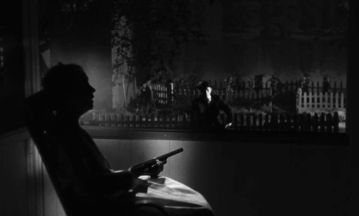
    The film is called, “The Night of the Hunter,” and evidently an American “film noir.” A slab of Southern Gothic set in the Depression era with and expressionistic look – all oblique angles, long shadows, shot in black-and-white; stylistically it was a throwback to 30 years before. Its is this look that heightens its sense of dread. And completely sets it apart from all other Hollywood films of the 1940s and 1950s.

    The Night of the Hunter is now regarded as a masterpiece of American cinema – which seems all the more remarkable for being the only film director Charles Laughton ever directed. Of course, it was not a success with either audiences or critics at its initial release, and as a result Laughton never directed another film. Such a shame.

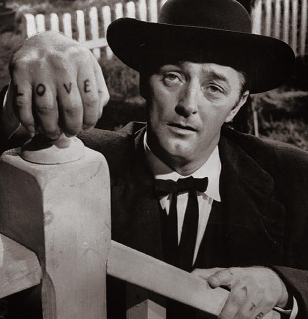
    The first still above shows Robert Mitchum playing Reverend Harry Powell, a crooked, demented preacher who preys on the weak. He’s an unforgettable, iconic character: on each knuckle of his right hand, the four letters, L-O-V-E are tattooed; on the left hand, it’s H-A-T-E. (For years afterwards, young men who considered themselves tough guys would get similar tattoos.) Mitchum's performance, in particular, has been praised over the years at last, and he is amazing.

    The second still above shows the gorgeous lighting arrangement in The Night of the Hunter. The placement of the key light off the subject to create a silhouette - while illuminating Robert Mitchum in the background. This plays off the conventional association of light with good and darkness with evil. Beautiful. DOP Stanley Cortez has says, “‘Apart from The Magnificent Ambersons, the most exciting experience I have had in the cinema was with Charles Laughton on Night of the Hunter.’”

    A recurring musical device involves the villain preacher making his presence known by singing the traditional hymn "Leaning on the Everlasting Arms." Which is creepy and sticks in your head.

    Watch a clip here.

    Suzan xx
    Posted in: film
    -Tags: night of the hunter
  • ARABIC calligraphy

    sharefacebooktwitter
    10 May 2016


    Hi MLE,

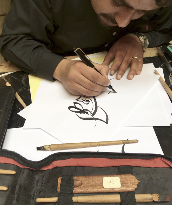
    As you know, I’ve always been really interested in calligraphy, so when I was in Morocco a few weeks ago now, I took a course for a couple hours.  Not enough time, but was great to just sit in a lovely cafe in Fes and chat with the calligrapher while he explained things and answered my questions.

    His ink jars had so much string in them, that if you turned them upside down, no ink would come out, which was pretty clever.  Most of his pens were wood with wood nibs.  He said his favourite pen was made from bamboo in the traditional way, to fit his hand perfectly.  It is something that lasts a lifetime.

    You can see him above writing around the word “Allah.”  It is the largest on the paper, as He is the most important, and must always appear so in written form.  After that, he added other words/sentences (but I forget what they say!)

    Not only is size important, but so is position.  For example, one would not position Allah on the far left side. Which, depending on what you would like to write, can be tricky to fit everything in. I reckon it may be a little like if you tried to fill a space with beautiful written text containing the lyrics to “hey jude,” but “jude” could never appear on the right.

    From listening to him, and watching him write, it seems that with Arabic you can arrange words horizontally all on one line or stacked, as we do.  But in Arabic, you play with different sizes and embed letterforms within other letterforms a bit more often.  To my eye, it seems that there is so much more variety in styles and ornamentation.

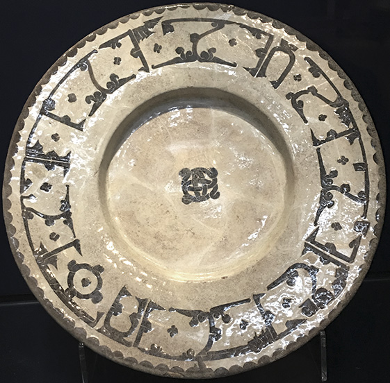
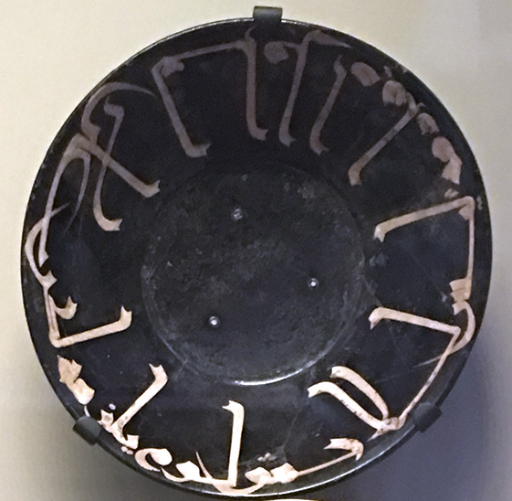
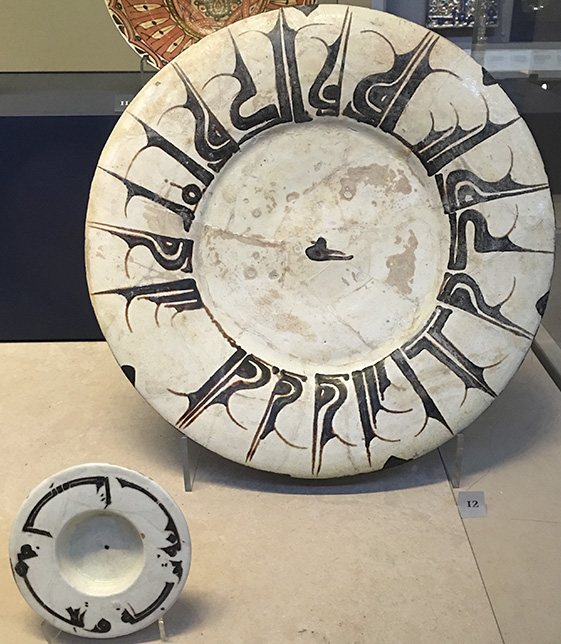
    For example, I was at the V&A last week and I found some gorgeous examples of calligraphy on ceramics from the middle east, all dating from around 1000.  The variety is incredible.

    Speak soon!

    Suzan xx
    Posted in: uncategorized
    -Tags: