• Profile
  • Clients
  • News
  • Work
  • Archive
  • Contact
  • FacebookTwitter

Moth and Rust

Search

When?

What?

  • web
  • typography
  • travel
  • theatre
  • textiles
  • tech
  • shopping
  • science
  • random
  • product
  • posters
  • photography
  • packaging
  • news
  • nature
  • music
  • MandR work
  • MandR news
  • magazines
  • interiors
  • illustration
  • identities
  • food
  • film
  • fashion
  • experiments
  • events
  • design
  • colour
  • chad
  • branding
  • books
  • awards
  • art
  • architecture
  • advertising
  • lil b
  • ads
  • logos
  • shops
  • blogs
  • uncategorized
  • environment
  • digital
  • social
  • flashback friday
  • ALL
  • Branding and Pattern

    sharefacebooktwitter
    12 July 2019


    Hi the MLE,

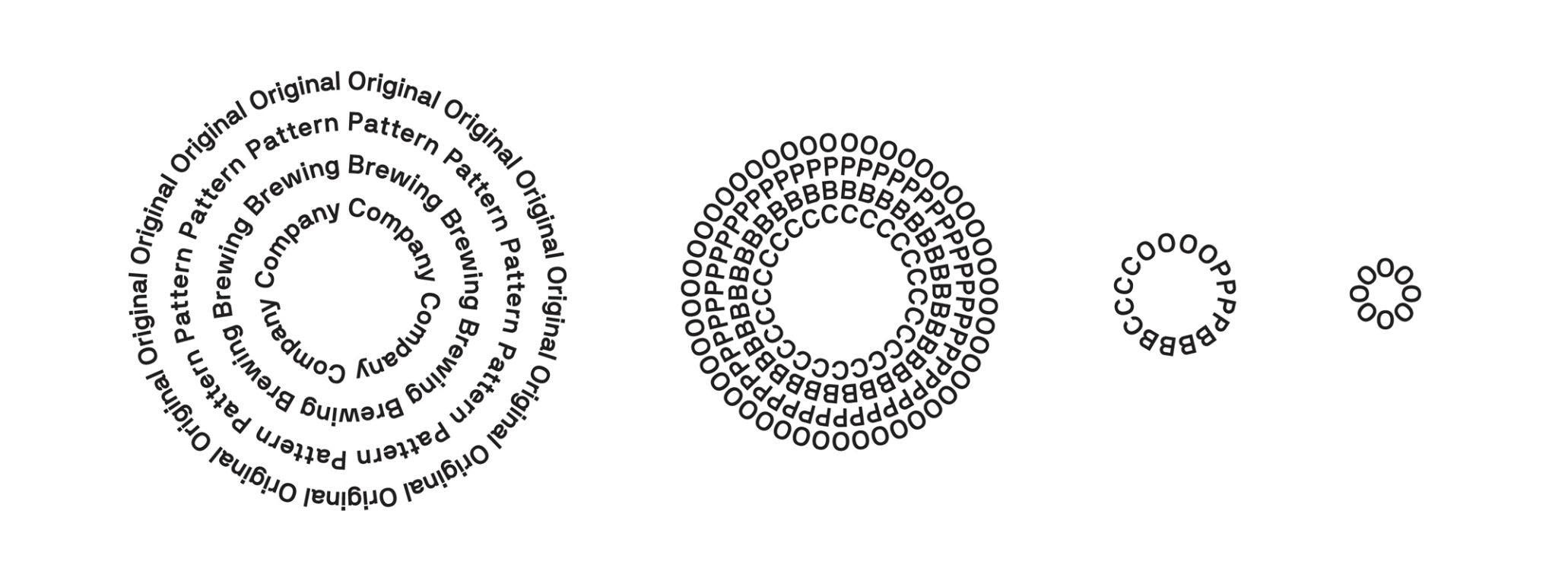
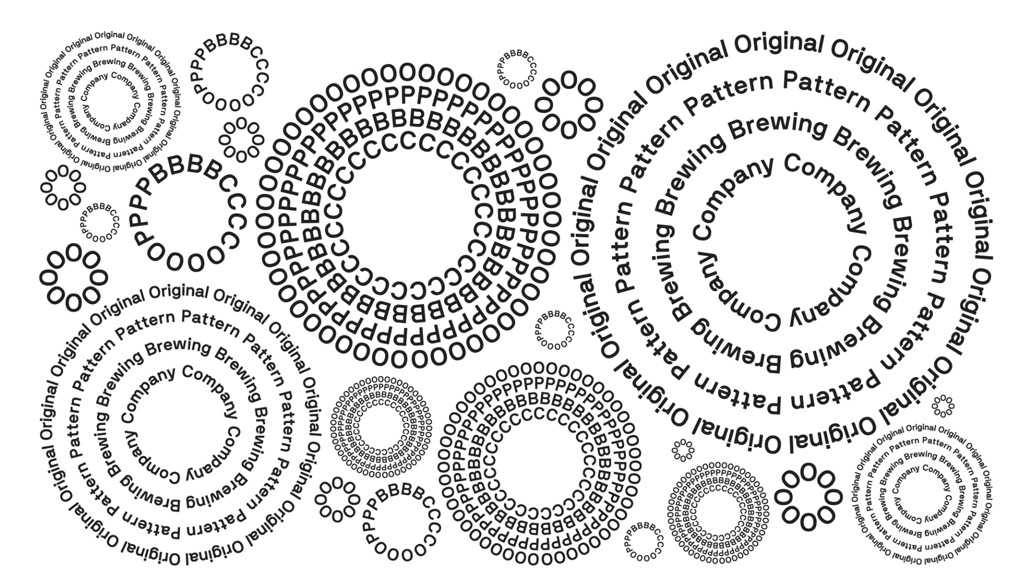
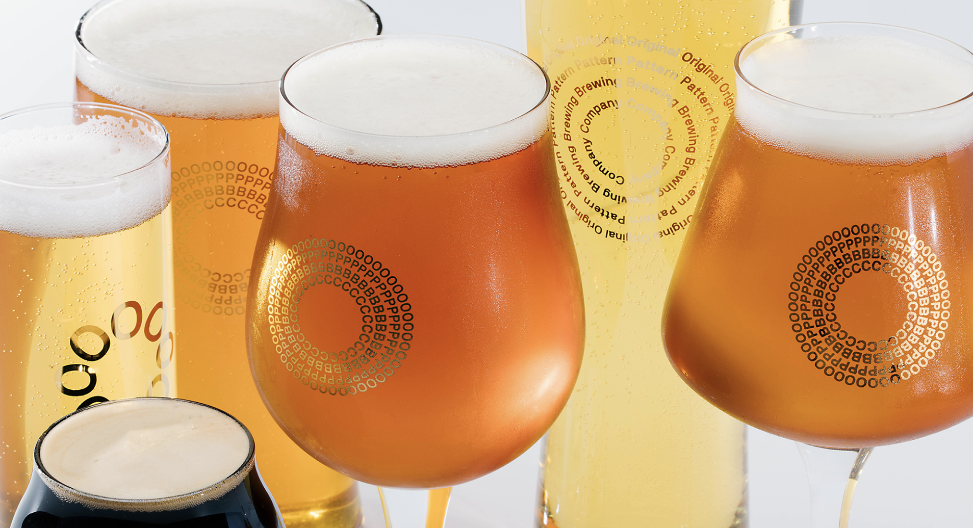
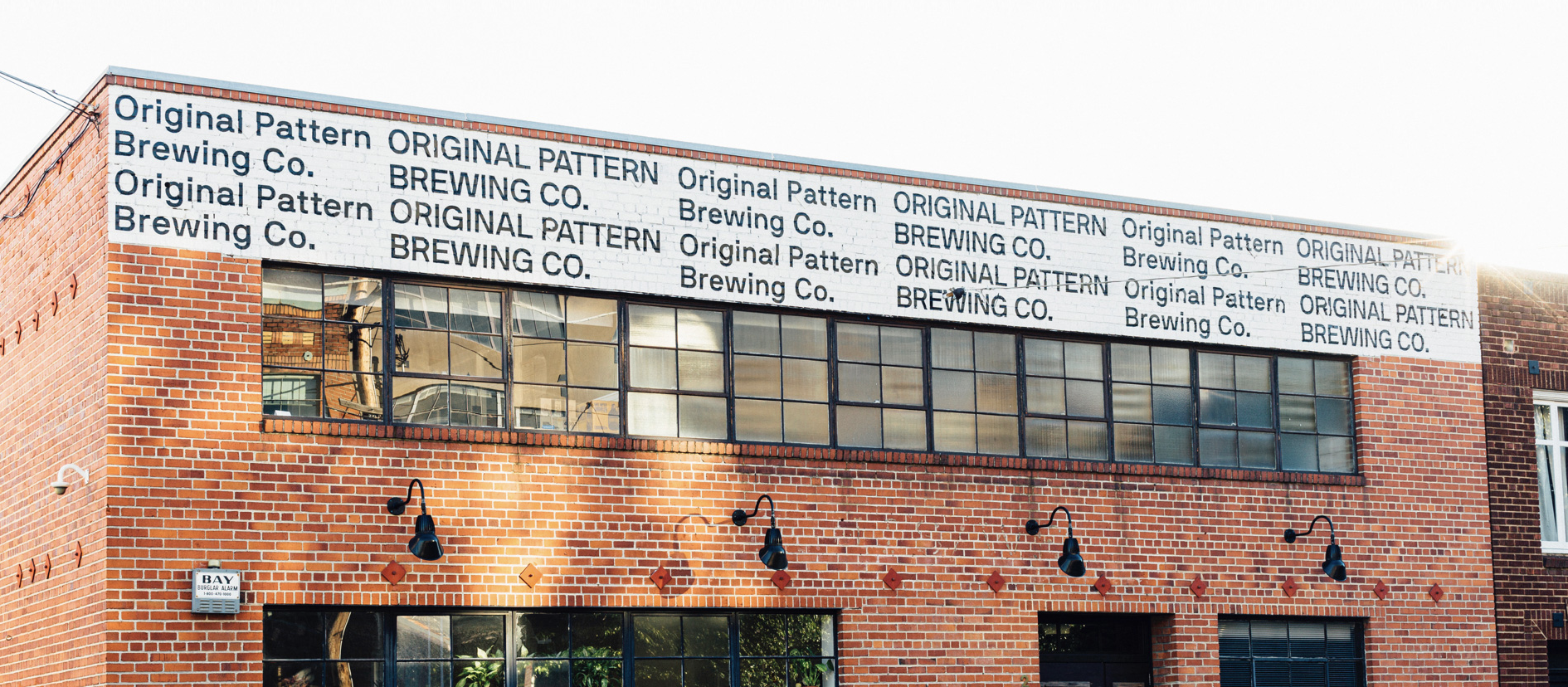
    You know I'm known for liking identities that involve repetition, and here is yet another new example. You are correct, this logo is not for everyone. In particular, the circular logo does not work well very small (it would not be legible), or in certain areas with restricted real estate, such as the top of their brewery (fourth image above, where the circular signage would not be legible, hence the less interesting and more plain repeating pattern). But in application as a poster or on drink glasses, it works quite well indeed (second and third image above).

    More info here.

    Suzan
    Posted in: branding logos
    -Tags: pattern