• Profile
  • Clients
  • News
  • Work
  • Archive
  • Contact
  • FacebookTwitter

Moth and Rust

Search

When?

April
  • January
  • February
  • March
  • April
  • May
  • June
  • July
  • August
  • September
  • October
  • November
  • December
  • All
2022
  • 2025
  • 2024
  • 2023
  • 2022
  • 2021
  • 2020
  • 2019
  • 2018
  • 2017
  • 2016
  • 2015
  • 2014
  • 2013
  • 2012
  • 2011
  • All

What?

  • ads
  • advertising
  • architecture
  • art
  • awards
  • blogs
  • books
  • branding
  • chad
  • colour
  • design
  • digital
  • environment
  • events
  • experiments
  • fashion
  • film
  • flashback friday
  • food
  • identities
  • illustration
  • interiors
  • lil b
  • logos
  • magazines
  • MandR news
  • MandR work
  • music
  • nature
  • news
  • packaging
  • photography
  • posters
  • product
  • random
  • science
  • shopping
  • shops
  • social
  • tech
  • textiles
  • theatre
  • travel
  • typography
  • uncategorized
  • web
  • ALL
  • @ThatDesignerOverThere

    sharefacebooktwitter
    26 April 2022

    Emelie and I speak often about the fact that so much of the graphic design that we’re exposed to in our mainstream media is from the US and Europe. It seems like we see the same trends over and over again, and it gets pretty samey-samey. From where we are, graphic design from around the world is not very accessible. We know that people are creating amazing things out there, in all corners of the globe—wouldn't it be nice to see more of that for a change?

    In an age of globalisation, we want to offer a broader perspective, interest, and appreciation of different cultures and voices. Our Instagram page, @ThatDesignerOverThere features graphic designers who are not from the US or Europe. We are introduced to their work, their workspaces, their challenges, what inspires them and what they are optimistic about. 
    Please do have a look and follow us. And we are always looking for designers to add their voices to this project.
    Posted in: MandR news
    -Tags: @thatdesigneroverthere
  • THE 27th LETTER of the alphabet: &

    sharefacebooktwitter
    6 April 2022

    The ampersand is a written character that represents a word, or a "logogram." You may notice that it sometimes looks like an "e" and a "t," in some instances. Well that's because it is! It originated as a ligature of the letters "et," Latin for "and." (As a French speaker, I see the French word "et," which means "and.")

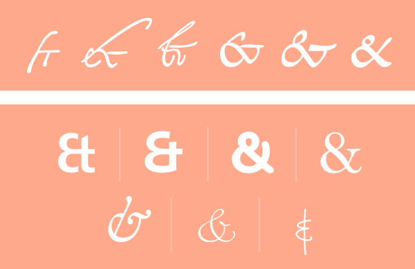
    The Romans first drew this ligature, most likely sometime before 79 CE. The image directly above shows how the ampersand has evolved from 131 to 810 CE. Since the ampersand's roots go back to Roman times, many languages that use a variation of the Latin alphabet make use of it as a stand-in for the word "and."

    For centuries it was regarded as the 27th letter of the English alphabet, which helped it get its own name. Traditionally, when reciting the alphabet in English-speaking schools, any letter that could also be used as a word in itself was repeated with the Latin expression "per se" ("by itself.") Eg: "A per se A." 

    The recitation of the alphabet would always end in X, Y, Z, "& per se &". This phrase was routinely slurred to "ampersand." By 1837 the term had entered common English.

    French “esperluette” may have a similar origin, “et per lui et”. The German name, in typical straightforward German fashion, is simply “Et-Zeichen” (“et symbol”).

    Type designers often put a lot of work into the ampersand and designers usually love to use them. So much can be done! For example, an ampersand in one typeface, can often look great set alongside another, completely different typeface. To note, typographic guidance says to only use ampersands in headers or logos. In body copy ampersands tend to stand out too much, disrupting the flow of the eye across a page.
    Posted in: typography
    -Tags: ampersand