Hi the MLE,
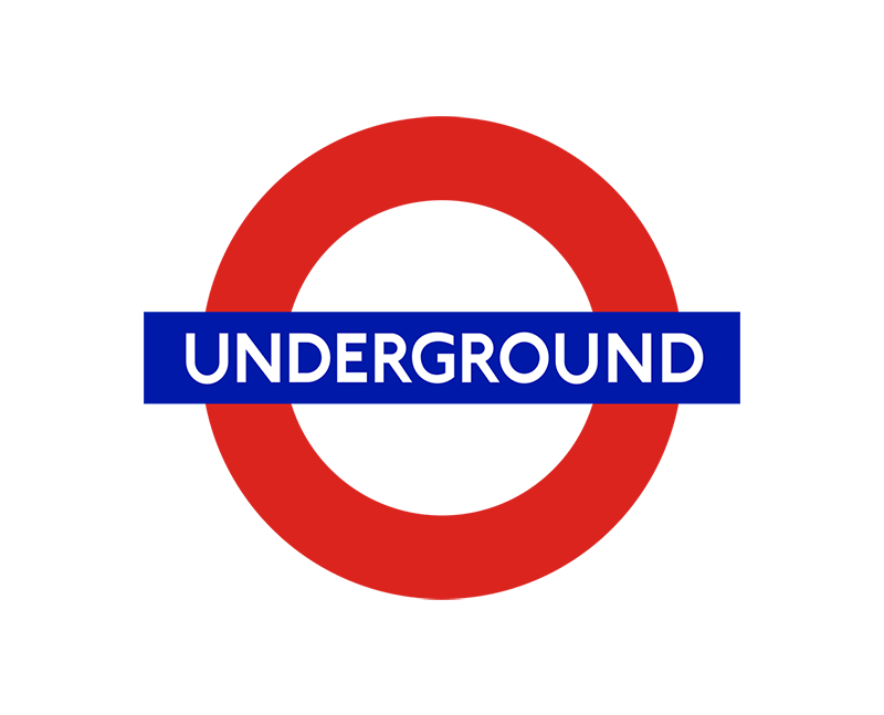
Our classic logos list would not be complete without the London Underground logo. I’d dare say it is the most recognisable logo that we have looked at, with so many imitators around the world. It is also one of the oldest classic logo we have seen, besides Michelin (1898). It’s hard to believe that the version still used today is almost 100 years old.
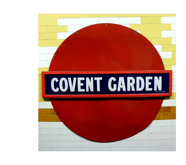
The roundel shape is actually more than 100 years old - it first appeared on station platforms in 1908. These early versions consisted of a solid red enamel disc and horizontal blue bar and served to highlight the station name amongst the surrounding ads. (See the Covent Garden sign above).
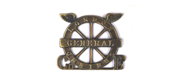
This is thought to have been inspired by “the winged wheel,” designed in 1905 for the London General Omnibus Company. (See the metal cap badge above).
British transport administrator Frank Pick, a man ahead of his time, knew the value of design: “Design is not a mode that enters in here and there and may be omitted elsewhere. Design must enter everywhere.”
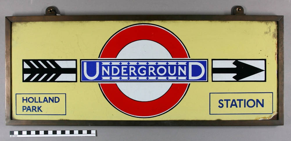
He commissioned Edward Johnson to create a standardised version of the logo (which up until then existed in a variety of forms) to strengthen the brand in the public’s mind. One can say that this job was a success! In 1919, the underground logo was born, with the white space in the center. (See the Holland Park sign above).
Then a German designer called Hans Schleger came along. He reimagined Edward Johnston’s bull’s-eye while creating signage for a system-wide collection of fixed vehicle stopping places in 1935. This was a very bold and innovative graphic for 1936, which drew on developments in modern art.
In the early 1950s the corporate symbol is finally streamlined to look more like Schleger’s logo from almost 20 years earlier. So much German influence on London during this time!
This is my last Classic Logos post. It’s been really interesting to explore the stories behind these logos. How portraying the company’s rich owner (Michelin) has fallen out of favour. How the lack of a strong marketing voice can lead to innovation (Deutsche Bank). How the love for a logo is actually tied up in the company itself, rather than the qualities of the logo (Apple, Nike). How much concept matters (FedEx). How inspiration can come from the most random places (CMS).
Suzan